10 tactics for effective Facebook pages you can implement by 30th March
Value/Importance: [rating=10]
Recommended link: Facebook’s Pages intro

With just one month before switchover to a completely new page layout for companies on Facebook, we’ve rated the impact as 10 out of 5, although that depends on how important Facebook is for your business...
If you’re short on time, I recommend you go straight for the new Facebook pages FAQ for a succinct summary. What Facebook won’t tell you are the marketing tactics that you lose and gain through the new update, that’s what we’ll summarise here, using examples to illustrate the new features.
With an update to a web service, you usually start by looking at what’s new, but with Facebook’s new business pages, what’s most striking is what’s missing since the changes to styling and functionality is so major. What’s missing is a huge headache for companies who are reliant on Facebook as their main way of interacting with customers online, which today is many FMCG brands.
In this update, Facebook have clear aims to keep the visitor within Facebook, and so generate more ad revenue and to enforce consistency of interaction. This isn’t a big surprise since the company pages follow the model of consumer timeline pages launched in January.
The big difference is the lack of opportunity to create gated Facebook pages to encourage Likes - perhaps companies will become more reliant on Facebook advertising to generate likes? To summarise some of the tactics that are no longer available on the home brand page:
- No gated Facebook pages encouraging likes to enter a competition.
- No permission marketing with data capture in return for information or other forms of value.
- No links direct to company website(s) - for example, many retailers have links from their home page to buy through the web store.
- No clear positioning messages - these aren’t permitted in the new main page cover image.
- No clear customer journeys through panels or links.
- No use of campaigns around specific products
You might think from these points, that I don’t like the new design, far from it - if you compare the old to the new, the design is more visually appealing and a better experience in my opinion. There are also opportunities to make good on all of these missing features through applications and other pages.
Changes to make to improve your brand communications
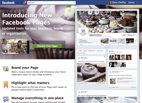
What then, do the new Facebook pages add, what new opportunities do they give? The best place to start is to preview your timeline which you’ll be able to do if you’re an Admin.
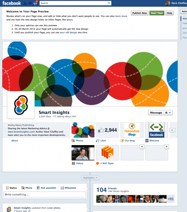
These are the key opportunities that are available from a marketing and communications point of view from top to bottom. If you use the preview mode we've been using to update the Smart Insights Facebook page, you can see what's possible.

Brand essence and value proposition
This is communicated through…
1. The cover photo
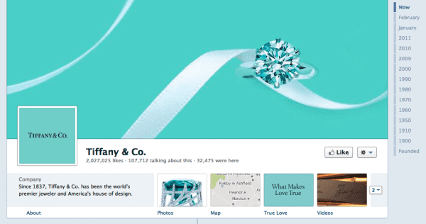
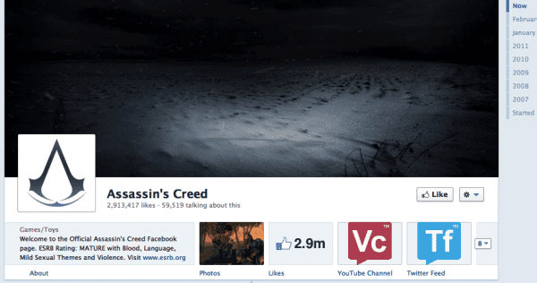
The signature feature consumer timelines, this will need special commissioning for best effect as Tiffanys have:

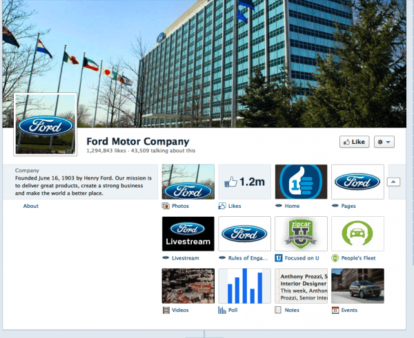
Others don’t work as well for a consumer facing site - Ford have this corporate approach.
Your limited by Facebook’s recommendations, they suggest a popular menu item, album artwork or a picture of people using your product.. They’re NOT allowed to be promotional or contain campaign calls-to-action - the staple of any home or landing page:
- Cover images must be at least 399 pixels wide and may not contain:
- Price or purchase information, such as “40% off” or “Download it at our website”
- Contact information, such as web address, email, mailing address or other information intended for your Page’s About section
- References to user interface elements, such as Like or Share, or any other Facebook site features
- Calls to action, such as “Get it now” or “Tell your friends”
It’s not clear how they will enforce this..
2. The brand ident
This is straightforward - this is the box on the left.
3. The page summary box
Important to explain your proposition given you can't add text to the main image. Options are limited according to the type of company.
Facebook says:
“You can edit the information that appears in your Page’s summary box below its profile picture, but you can’t choose which fields display there. The types of information that appear in the summary box are specific to your Page’s category. For example, Pages for restaurants show price range, address, phone number and hours of operation in the summary box, while artist/musician Pages show the About field of the Page’s basic information”.
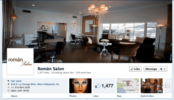
This example for a hairdressing salon show how small companies can feature maps and other local information that is neat.

4. Direct link to website
This has always been available through the summary info - it’s a trick we’ve used - feature www.domain.com in the summary and it will be displayed. It’s an approach most companies in the preview don’t use - but I noticed this gaming company using the approach prompting a visit to the site.

Customer journeys
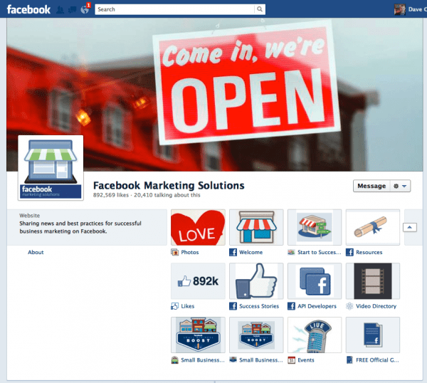
Access to different content are available through “views and apps” which appear on the right below the cover image. The Facebook Marketing solutions page gives one of the best examples of these - it’s the best example of a B2B page - you can see here they are expanded:

5. Views
The pages that are featured before expansion can be moved - so three of the key pages can be moved. Developing appealing icons may help here
6. Apps
Apps become more important for encouraging interactions with this change although it will be more difficult to encourage people to engage with the limited space available for call-to-action. Take a look at the range of Ford apps which include this video/chat box and permission marketing promos.

Publisher / editiorial features
There are several editorial options to position your most popular content more prominently. I noticed around half the featured sites weren’t using these so make sure you take advantage of these
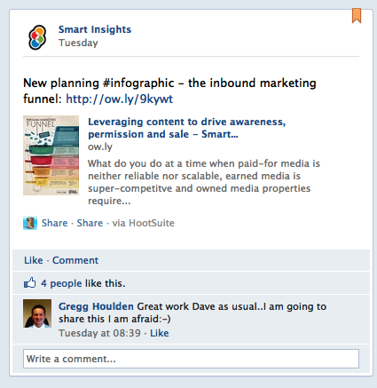
7. Pinned posts
This example shows how we can feature our new infographics in a prominent position top left:

8. Starred posts
By starring a post it will appear across the full-width
9. Timeline
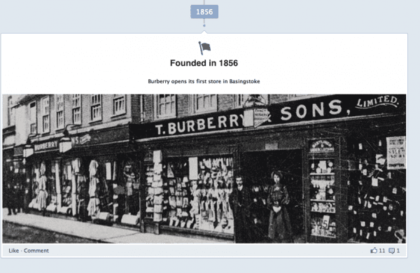
Last, but not least and fundamental to the update you can add images for earlier in the brands history. This has Burberrys have evolved.

Well, those are our tips for setting up your page for effective communications based on a first look. Do let us know any other tips or features to make it more effective - we certainly need to tweak our page in the week ahead.


