A key mobile design trend in 2013
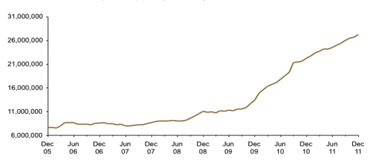
Mobile usage is only going one way. Up. Rapidly.

UK mobile adoption exploding: 27 million regular users, 54% of all mobile users. Source: Comscore.
But how good are the experiences we're building for customers? Designing experiences on mobile is challenging because of the form factor and because it's a relatively new design approach with the tools and technologies evolving fast. Brands also want to get to market fast.
Today's mobile designs often fail to differentiate brands
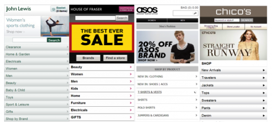
These challenges can lead to some "screen scrape" design approaches where every site looks similar, with little differentiation of brand or experience. These 4 retail sites show this:

Don't get be wrong, these sites show a lot of features of good mobile sites. They meet many of the best practice requirements: content must be quick and easy to find, as mobile browsers have limited time, and immediate ‘intent’. Navigation is critical. Content should always be accessible within 3 clicks, and mobile sites should be built “on-tracks”, i.e. scrolling should be vertical only, not horizontal. Consistency with convention will help usability.
Some of this standardisation can be explained by brands wanting a quick route to market, which avoids contact potential conflict between PC web and mobile web developers; separate teams using separate tools.
However, there are disadvantages of screen scraping when compared with a fully integrated approach, which provides the better long term solution. The screen scrape option will incur additional time and cost to manage the site, as changes to the back end CMS will need to be updated manually on the mobile site, rather than benefitting from automatic updates.
Towards a more personalised approach to mobile design
The biggest advantage of the integrated approach ties in with mobile biggest strength as a marketing channel: personalisation. Ask a group of strangers to pass their phones around the room and you'll detect a potent sense of anxiety. We don't share our phones, with anyone. We don't want others seeing the texts we send and receive, the photos we've taken, our social media pages, the sites we've browsed or the Apps we've downloaded. Our phones are highly personal.
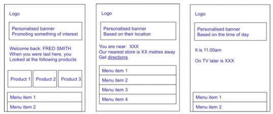
Back end integration, with APIs exposing individual customer records, can be used to build bespoke sites which match the profile of each user. Look no further than Amazon to see how brands can use purchase history data and apply intelligence to develop sites with highly targeted product offers. To make your sites highly relevant to users, you can apply behavioural, targeting, with time and location sensitive messaging.
This is the way the designs above could look if designs were more personalised:
 I haven't seen many sites which use this approach yet. Which mobile designs do you think do a good job at personalisation and differentiation?
It will be interesting to see more innovation in mobile design in 2012. There's a trend among pioneering mobile brands to design mobile sites which look and feel like mobile apps, with clickable icons rather than text links. Their goal is to present a more engaging user experience, and a more user-friendly interface. Look out for more of those in 2012.


