Examples showing what is needed for a customer-centric B2B website
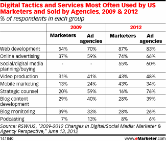
In a recent post, I talked about the importance of developing a solid B2B digital marketing strategy. A critical part of this is creating an enduring website presence that meets the needs of visitors while also achieving standout, leads and favourability for the business. Making their site more effective for visitors and the business should be a primary concern, but it often hasn't got sufficient attention in the past. But this seems to be changing; 2012 RWS/US research data suggests that marketing budgets are being invested more in websites and web development than anywhere else. Yet I still see a lot of basic requirements of an effective B2B site that are missing. In this post, I'll give examples showing some of the key features.

The seven essential features
Start by defining your requirements. Even if the project is being managed in-house, write down what you want and what the critical elements need to be in the form of a brief to collect your thoughts. Committing ideas to paper increases the chances of success. I suggest you cover these areas:
1. Consider first impressions
Your website offers a first impression to many visitors coming into contact with your business for the first time and needs to represent who you are and what you offer. Jacob Nielsen’s belief that you only have ten seconds to show your face to the world has probably been cut to five seconds in 2013 (or even less!)
Consider from the outset that first time visitors to a website seek assurance and credibility. It needs to convey that there is a stable, physical business behind the site and that is a company they want to do business with.
2. Build in honesty and integrity
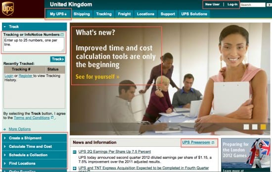
Setting the tone on your website as helpful and offering resources like About Us, Our Mission, Our Philosophy and FAQs all help establish subjective attributes that customers look for. The UPS website showcases lots of ways to use content to provide customer support and useful information.

3. Make it easy to use
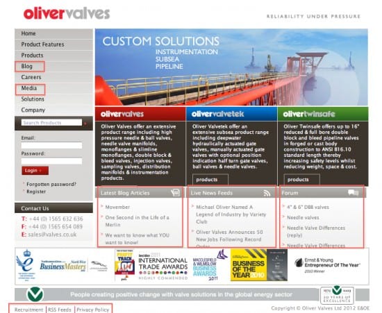
Bad navigation can so often result in a high bounce rate and reduced traffic. Using well-known Western T & F navigation formats ensures visitors can find what they are looking for quickly and easily. Most of the sites selected in this blog post feature horizontal and vertical navigation to facilitate easier and quicker access to critical information.
4. Update the content frequently
Content is the biggest part of your website strategy as it governs your selection of keywords, what you say, how and when you say it. Websites that offer frequent updates to pages that can be subscribed to – such as news and blog pages and other pages – ensures customers come back for more.
Oliver Valves, an equipment supplier to industry, has broken from the norm in its sector by providing a blog and a variety of news-based RSS feeds. Perhaps more importantly, it has ensured the search engine bots indexing the website for the keywords being used help maintain a high visibility in search engine results.

5. Use design as a differentiator
Most of the focus in web design inevitably falls on the process that delivers the look and feel for a website. But the visual branding is really important to help differentiate your offering AND to develop credibility. Use templates for different parts of the site – to cover home page, product/service and forms. Do think about typography and images that can make a page really pop. Avoid too much colour and too many distracting animations and calls to action.
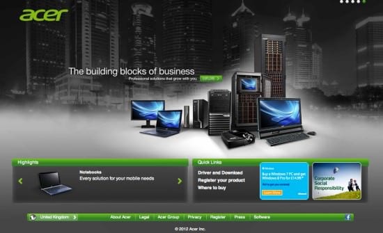
Acer achieved a brilliant design and user experience through combining colour, shape, typography, photography, graphics, sound and video. This proves that a good B2B website design can create atmosphere as well as consistency in identity. This can also help provide a framework to support the functional requirements a site needs to have as well as the content it should contain to deliver a superior customer experience. In the Acer example, the signposting to other areas of the site becomes an intrinsic part of the design.

6. Build user experience driven landing pages
User experience (UX) focuses on digital interactive products, including software applications and websites. A positive and consistent user experience can be achieved by combining creative and functional design activity with accessibility, usability, information architecture and user interface design, which we go on to talk about below.
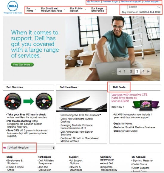
It is important to recognise that user experience is a key part of branding. Sites like the Dell site, which signpost routes to the content different audiences are looking, also generally provide a better user experience. This, in turn, increases conversion rates by generating trust and encourages both loyalty from existing users and new traffic from viral referrals.

7. Test, test, test
Ok the blog title said seven steps so consider this a freebie for getting this far!
As with all digital projects, testing is crucial – before launch, but also throughout the entire development process. When testing a complex interactive product such as a website, the first questions should reveal whether the system is even ready for further testing. Does it actually work? If the product isn’t usable on even the most basic level, real functional testing cannot begin.
The second stage focuses on testing the implementation against the specification; to compare what has been built against what was envisaged.
Pre-launch testing should then be done exhaustively and with as many people as possible to check things like if a user
- enters a date in the wrong format?
- inputs words instead of numbers?
- tries to input JavaScript or SQL queries?
- omits required information on a form?
- seeks to override data entry on a form with special characters and not actual contact information?
Summary
B2B websites are very different to B2C websites because of the way they are interacted with and the requirements of the users. They are rarely about immediate transaction. Most B2B websites are geared towards acting like a shop window or a content hub for advice and support on specific problems and challenges.
Knowing now that you have five seconds to keep that website visitor a little longer, what will you do differently? Share your challenges and approaches below.
My next blog post will cover some of the specific B2B digital marketing challenges in the area of search engine optimisation.
For more guidance on creating and implementing effective B2B sites, download the 7 steps digital marketing guide for Smart Insights Expert Members. You can also buy the Ebook Brilliant B2B Digital Marketing on Amazon.


